8.1 Built in plotting functions
When working with large sets of numbers it can be useful to display that information graphically.
R has a number of built-in functions for creating plots such as histograms, scatter plots, bar charts, boxplots and much more.
We’ll try these out using the cats data introduced earlier.
The plot() function provides a method for generic x and y plotting (e.g. scatter plots).
Scatter plot
Let’s start by creating a scatter plot. A scatter plot provides a graphical view of the relationship between two sets of numbers.
We can create a scatter plot using the plot() function and supplying the x and y coordinates of the points.
Using the cats data, we can make a scatterplot of kitten birth weight by mother’s age.
cats <- read.csv("data/herding-cats.csv")
plot(x = cats$age, y = cats$weight)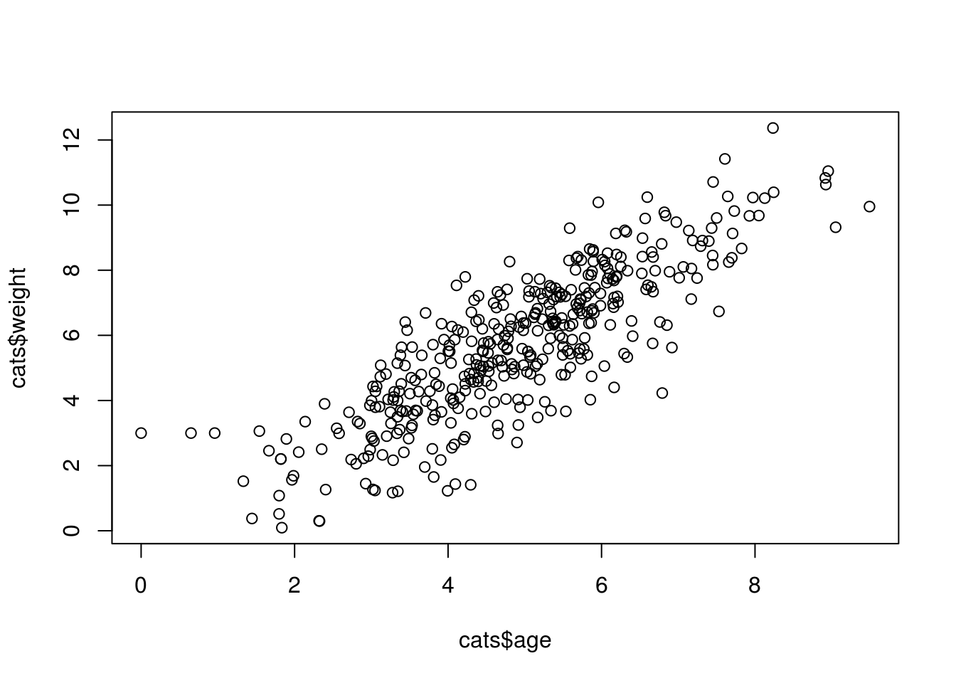
Each point represents a row in our dataset. The value on the x-axis is the mother’s age and the values on the y-axis correspond to the birth weight for the infant. For any plot you can customize many features of your graphs (fonts, colors, axes, titles) through graphic options.
plot(x = cats$age,
     y = cats$weight,
     xlim = c(0, 10),
     ylim = c(0, 15),
     xlab = "Age",
     ylab = "Weight",
     main = "Weight by Age",
     las = 1,
     col = factor(cats$coat))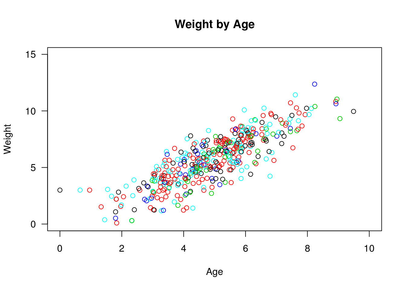
In this example